A Case Study on Redefining the Credit Card Experience
Role
Product Designer
Timeline
2 days
Team
Solo
Company
The Card Company
🧩 The Challenge
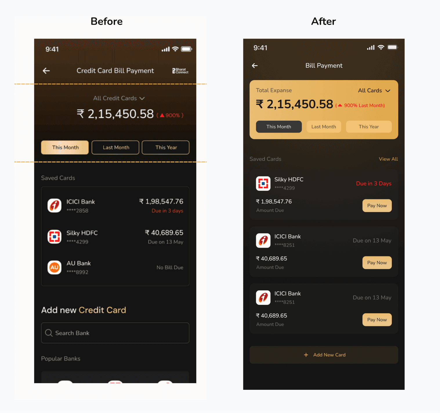
The original screen needed improvement in several areas:
Unclear information hierarchy
Lack of actionable elements
Missing contextual insights
Cluttered interface with unnecessary elements
Users had to take extra steps to complete primary tasks
🎯 Context
Internal data shows that credit card payments are one of the most frequently used features within the product. The goal is to leverage this insight by creating a more user-friendly, engaging, and frictionless experience.
My Task
UX: Design the credit card flow considering both stakeholders (company and user)
UI: Redesign the Credit Card Home Screen Dashboard that displays total expenses made through credit cards

Understanding User Needs
I started by identifying what users need from a bill payment screen:
Primary Needs:
Quick overview of total spending
Clear view of pending bills
Easy way to pay bills
Understanding spending patterns
Secondary Needs:
Compare spending across time periods
Add new cards easily
Access different cards quickly

❓ Identifying Pain Points
From the original design, I identified these friction points:
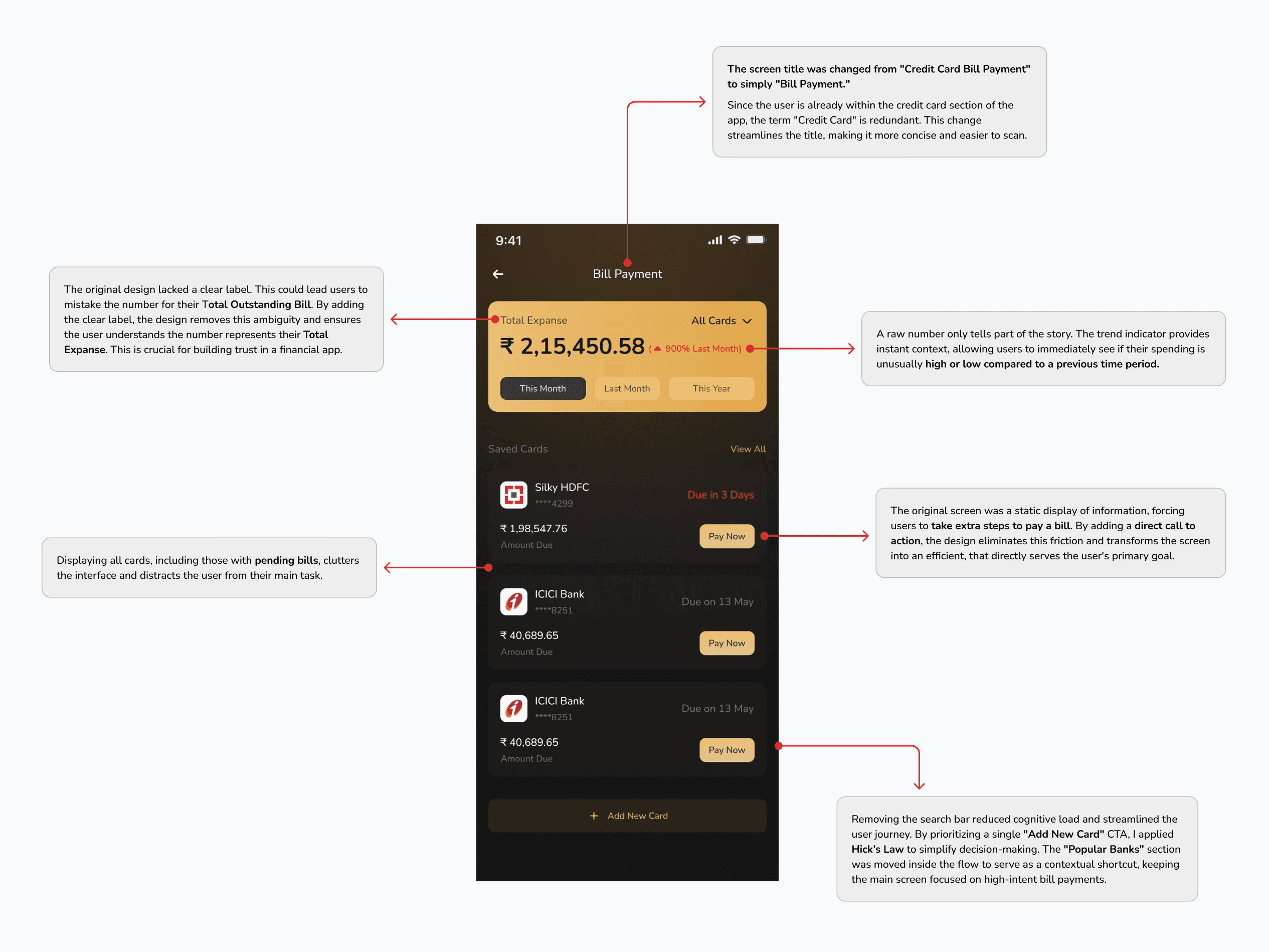
Ambiguous labels causing confusion about what numbers represent
No direct path to pay bills (extra navigation required)
All cards shown regardless of pending status (information overload)
Search bar adding unnecessary complexity
No spending insights or context

🟧 Design Constraint
Black background theme
Nunito typography
Must display all important information clearly
Design Principles Applied
1. Clarity Through Simplification
Every element earns its place. Removed redundancy and unnecessary features.
2. Action-Oriented Design
Transformed passive display into an active tool. Primary task is one tap away.
Visual Hierarchy
Trend indicators and comparisons help users understand spending without manual work.
Trust Through Transparency
Clear labels and explicit amounts. No ambiguity in financial information.
Challenges & Trade-offs
Trade-off 1: Showing only pending bills requires an extra tap to see all cards.
Accepted because: 80% of users visit to pay bills or check spending. The "All Cards" dropdown serves the remaining 20%.
Conclusion
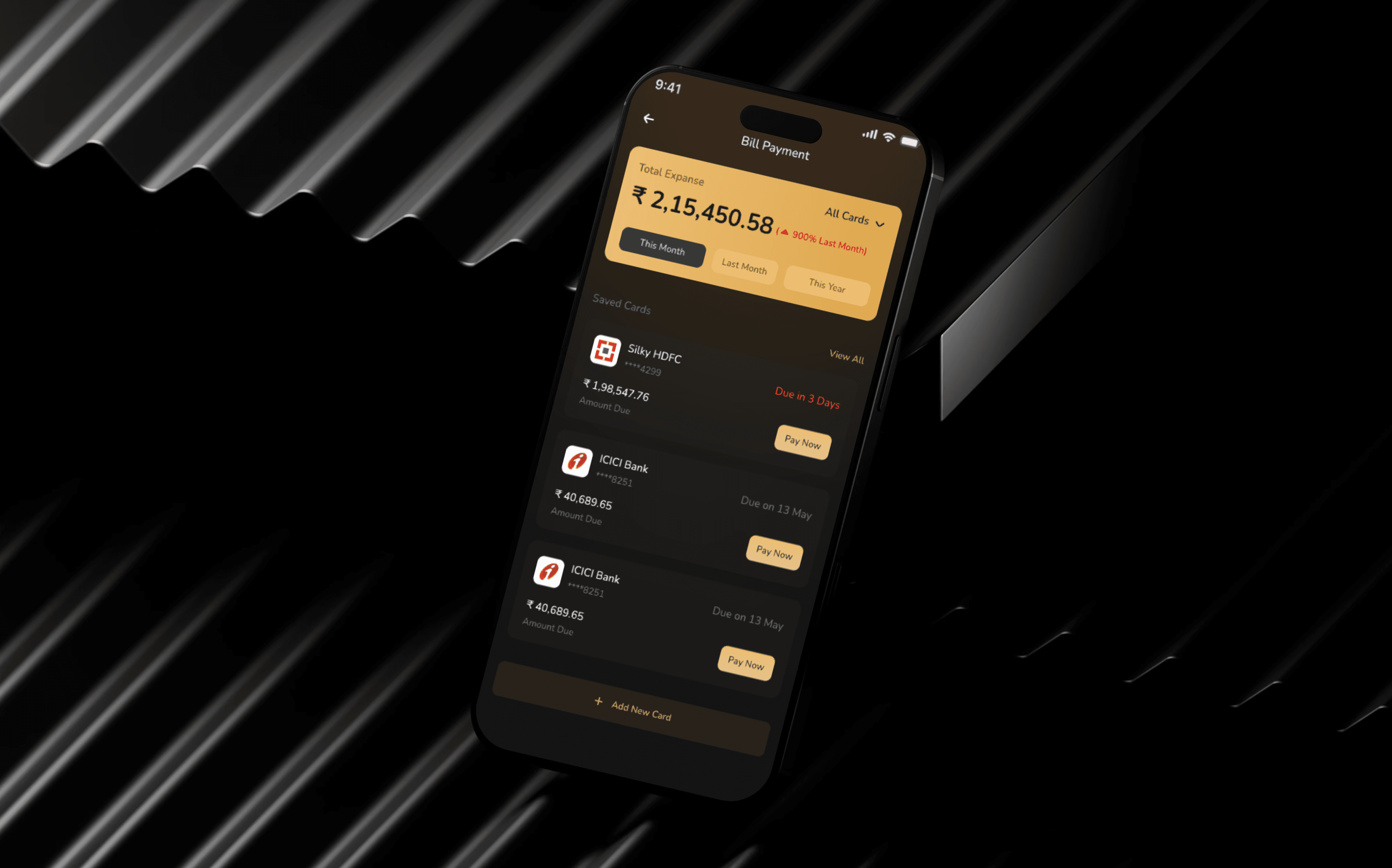
This redesign transformed a passive information screen into an efficient bill payment tool. By focusing on clarity, efficiency, and actionability, the design serves both user needs and business goals.
Key Improvements:
✓ Clear labels prevent confusion
✓ One-tap bill payment reduces friction
✓ Contextual insights encourage engagement
✓ Smart filtering reduces cognitive load
✓ Streamlined card addition improves adoption
Reflection: Design Insights
1. Design is Deliberate Choice
Every element must serve a purpose. By balancing user needs with business goals, I ensured that every label and button placement was a strategic decision rather than a decorative one.
2. Context-First Approach
Bill payment screens are functional tools, not static displays. Users arrive ready to pay, check, or review so the layout prioritizes prominent "Pay Now" triggers that enable immediate action.
3. Simplicity via Prioritization
Clarity often requires removing noise. By hiding zero balances and focusing on pending tasks, I used progressive disclosure to provide depth without overwhelming the user.
4. Trust through Clarity
In fintech, ambiguity causes anxiety. Refining labels like "Total Expense" proved that transparent, precise language is essential for building user confidence and reducing friction.